Bold Typography in Packaging
The market was saturated with over-designed packaging relying heavily on imagery. The client needed a design that stood out with simplicity while reflecting a strong, confident brand voice.
Overview
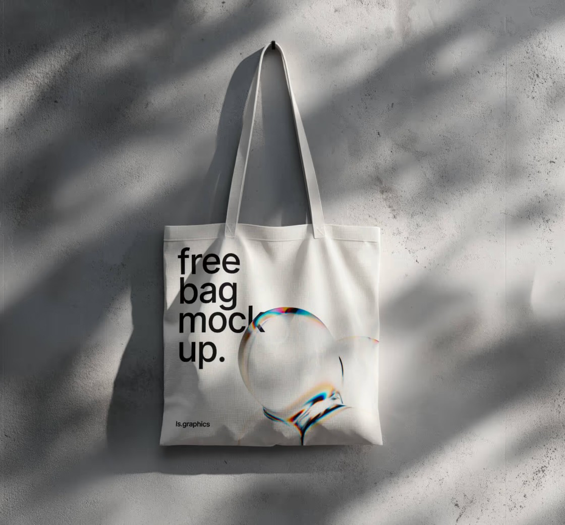
Nos enfocamos en hacer de la tipografía el elemento central del diseño: limpia, atrevida y decididamente simple. Al utilizar la tipografía como la identidad visual de la marca, creamos una apariencia que era instantáneamente perceptible y memorable.
Lo que hicimos:
Elegimos tipografías fuertes y distintivas para que coincidieran con el tono de la marca.
Utilizamos la escala, el espaciado y la alineación para crear diseños dinámicos.
Mantuvimos la paleta de colores al mínimo para dejar que la tipografía brillara.
Creamos una jerarquía utilizando pesos de fuente y contraste para un escaneo rápido.
Client
Gary Neville
Industry
Personal Branding
Duration
12 Weeks
Year
2033
In a competitive market of vibrant colours and overwhelming visuals, our client’s product was getting lost on the shelves. The brand wanted something that wouldn’t blend in—something that would interrupt the shopper’s line of sight.
{
01
Challenge
In a saturated market filled with visual noise, the client needed packaging that would stand out instantly on shelves and communicate brand.
02
Solution
We embraced bold, expressive typography as the core visual element. Through strategic font pairing, oversized text layouts and high-contrast colour schemes.
03
Result
The new packaging elevated brand visibility by 35% in retail settings and significantly improved consumer recall, reinforcing the brand's confidence.

Result
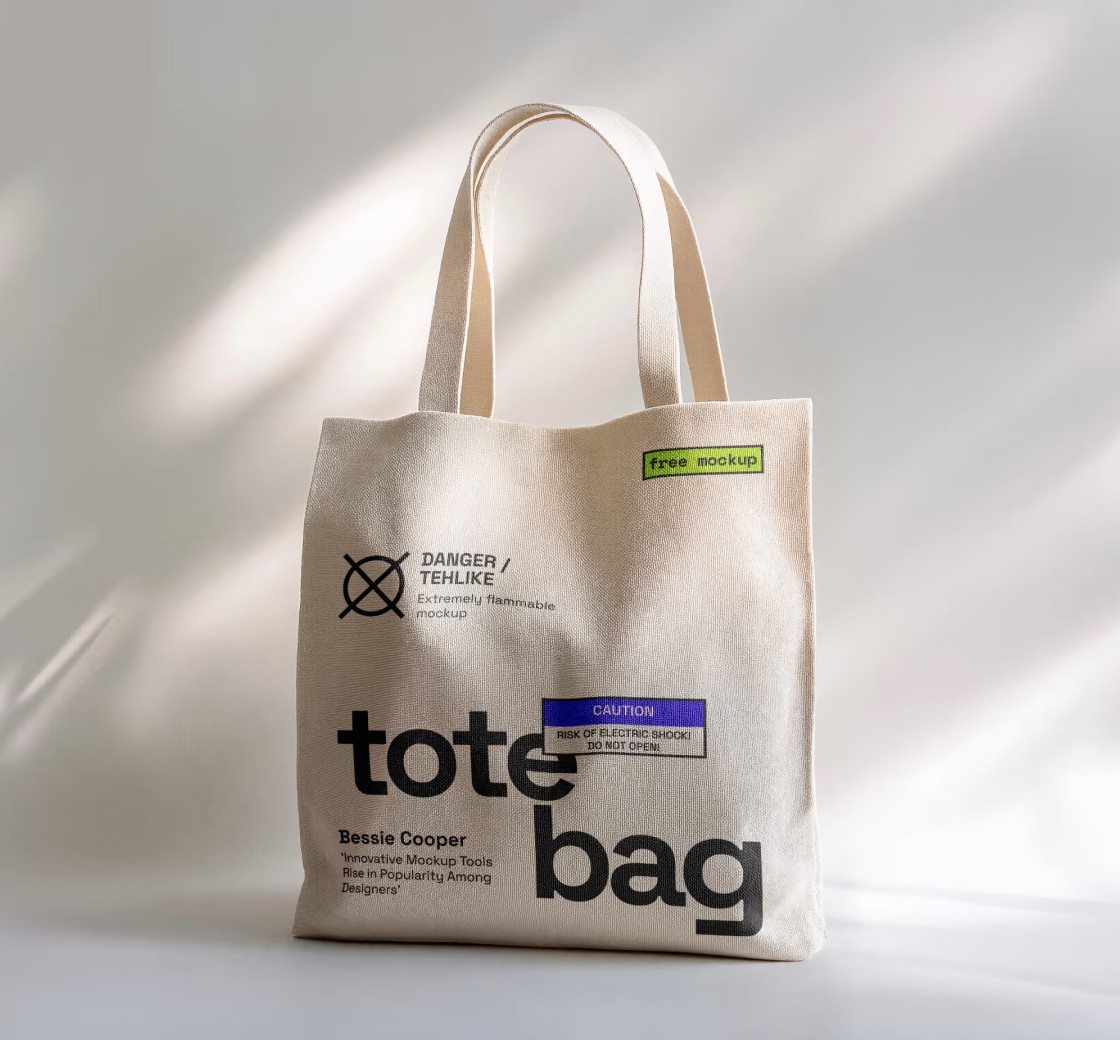
The final packaging became a visual signature for the brand, improving visibility and recognition while setting a new standard for minimal design in the product category.
Impact:
35% boost in shelf visibility and buyer recognition.
Increased social shares and positive consumer feedback.
Featured in two leading packaging design blogs post-launch.